

SpruceID’s Comments to NIST on AI Agent Identity and Authorization
SpruceID submitted formal comments to NIST's NCCoE on how AI agents should be identified, authenticated, and authorized. Here's what we said and why it matters.
SpruceID’s mission, since the founding of our company, is to let users control their identity and data across the web. From a very early (still accurate) SpruceID blog, “Our ultimate goal [is to] enable a future where everyone has access to a secure, private, and highly portable set of credentials and data they can take with them across the digital universe. In this future, these credentials will be inalienably yours, to use when necessary to gain access to a given area or activity.”
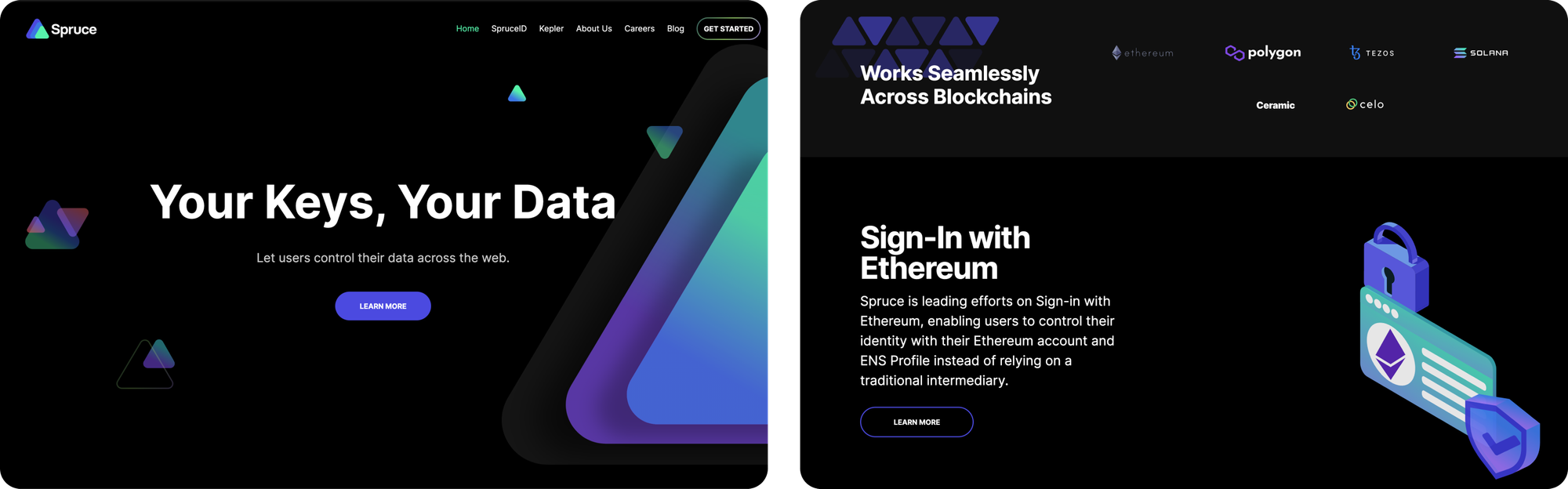
In the early days, we found our roots (yes, tree puns never get old) within the Web3 developer ecosystem, building a suite of open-source libraries to connect on-chain and off-chain identifiers and activity. Our early branding reflected this developer audience focus, featuring a dark mode design with futuristic graphic imagery and technical language that resonated with developers deeply embedded in the Web3 ecosystem.
We quickly learned that in addition to the tens of millions of people using cryptographic keys on Ethereum, there is another major audience actively using public-private keypairs that is already deeply entrenched in the business of issuing credentials to people – governments.
In 2022, SpruceID won a contract with the California DMV to build out a mobile driver’s license solution and wallet application for Californians. This project underscored the importance of privacy-forward, standards-compliant verifiable digital credentials (VDCs) that can be seamlessly integrated into both public and private sector systems. We were, and continue to be, excited and honored to collaborate with true visionaries at the California DMV who have worked tirelessly to champion the privacy and security of users in the pilot program.
Since our initial foray into the public sector, we’ve found a strong foothold and have begun work on VDC implementation contracts with multiple state-level and national governments that are ideologically aligned with our values.
Today, we are excited to announce a significant rebrand that aligns with our expanded mission to serve not only Web3 enthusiasts but also governments and enterprises. Our updated look features lighter colors, more approachable and tangible design elements, and our messaging is crafted to be inclusive and easily understood by stakeholders at all levels.
At the heart of every brand is a visual identity that resonates with its audience and communicates core values. We began our rebrand journey with the question: Who are we designing for? What do they care about? What motivates them? How do they like to learn?
Throughout this initiative, we relied heavily on research about our key audiences to ensure that all elements of our new brand (logo, colors, fonts, and tone) communicate the values most important to us and resonate with those with whom we build relationships.
Read on to get an inside look at our creative process, led by our Sr. Designer, Scotty Matthewman.
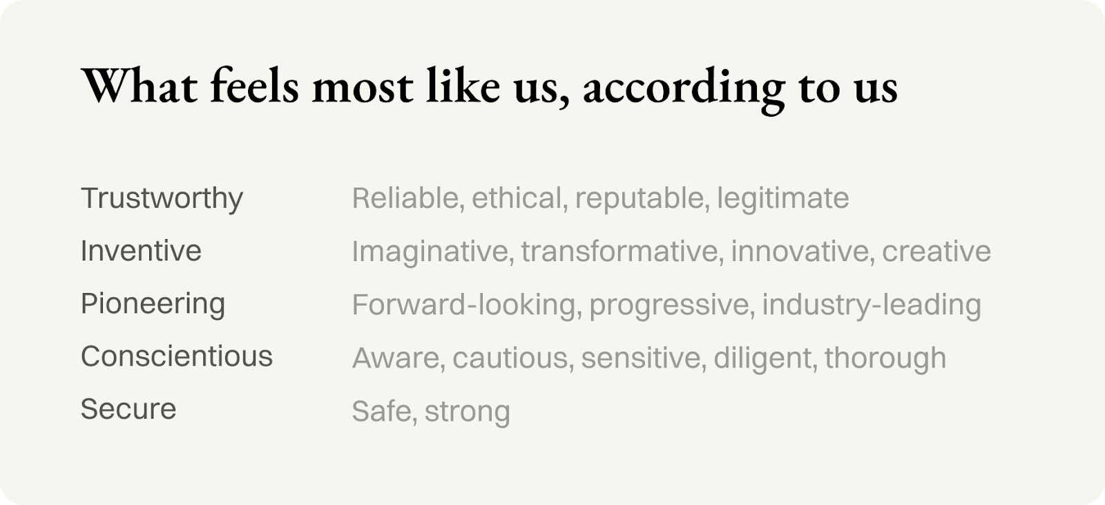
At the start of this project, we distilled our values into 5 core attributes: trustworthy, inventive, pioneering, conscientious, and secure. These values influenced every aspect of our rebranding effort, from the tone of our communication to the visual elements of our identity.
We broke out our core values to brainstorm synonyms (below) that might spark visual reactions within our audience, and allow those experiencing our brand to feel heard and served by the solutions we offer. We ultimately aimed to create a brand that not only comes across as professional and reliable but also feels inclusive and innovative.
The evolution of our logo began with a focus on our core mission: empowering people to have greater control over their personal data. We explored many different iterations and directions, drawing inspiration from our design values while also trying to capture elements of identity, innovation, and security.
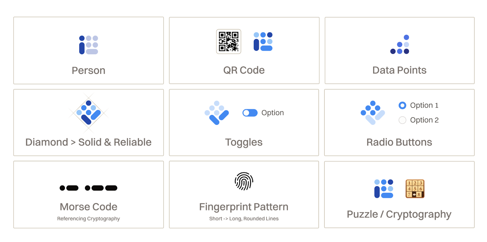
We liked the idea of many small elements, representing that people have many facets of their identity.
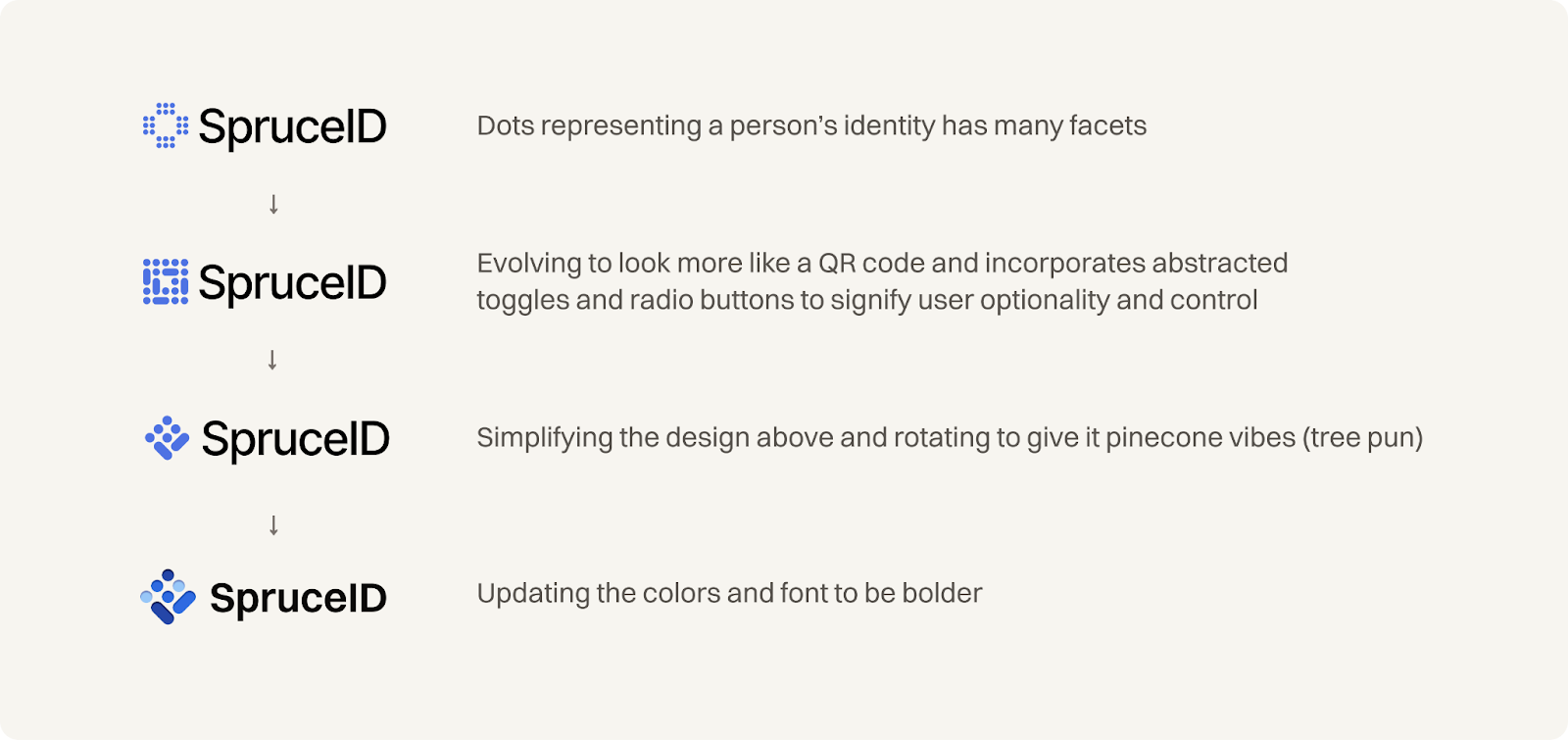
This direction felt representative of a few elements that resonated with us:
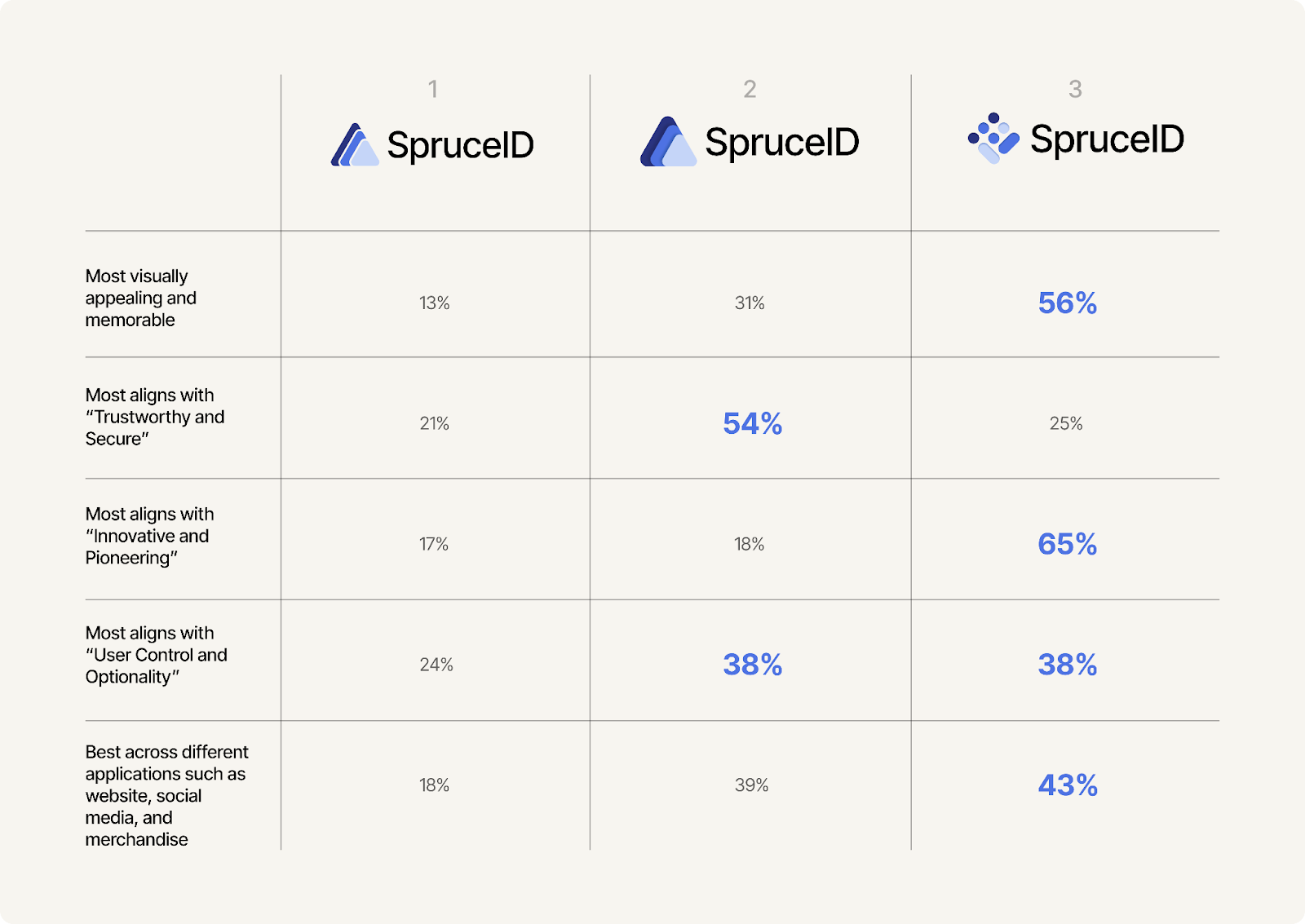
With a version we felt excited about, we decided to validate our hypothesis with real people within our key audiences. We surveyed a group of users to share feedback and preferences among three different logo iterations (see survey results below).
With positive user feedback on the logo direction, we shifted our focus to defining our brand colors, fonts, and imagery.
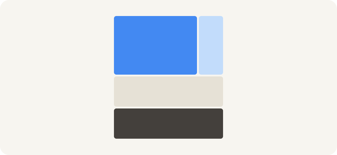
Choosing the right color palette was important in setting the tone for our brand. We wanted a color that conveyed trust and safety, which is traditionally represented by blue. However, we also wanted to avoid the commonly used vibrant blue, so our solution was a muted blue with a slight lean towards purple, creating a balance that feels trustworthy, innovative and approachable.
The primary colors we landed on for our new brand are ‘Spruce’ blue, warm white, and black, complemented by warm neutrals with splashes of purple and green for vibrancy. This combination helps us stand out while maintaining a professional, inviting, and authentic appearance that resonates with our audience.
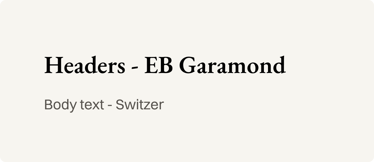
In selecting our fonts, we aimed to balance modernity and readability. Initially, we experimented with sans-serif fonts, which are notoriously clear and accessible. We wanted something that was not extremely emotive or overly playful, but also that would allow us to be memorable and unique.
Our final choice includes Switzer for body text, known for its versatility and legibility, and Garamond for headers—a serif font that is also easily legible and adds a touch of traditional elegance. These design choices emphasize our commitment to humanizing technology.
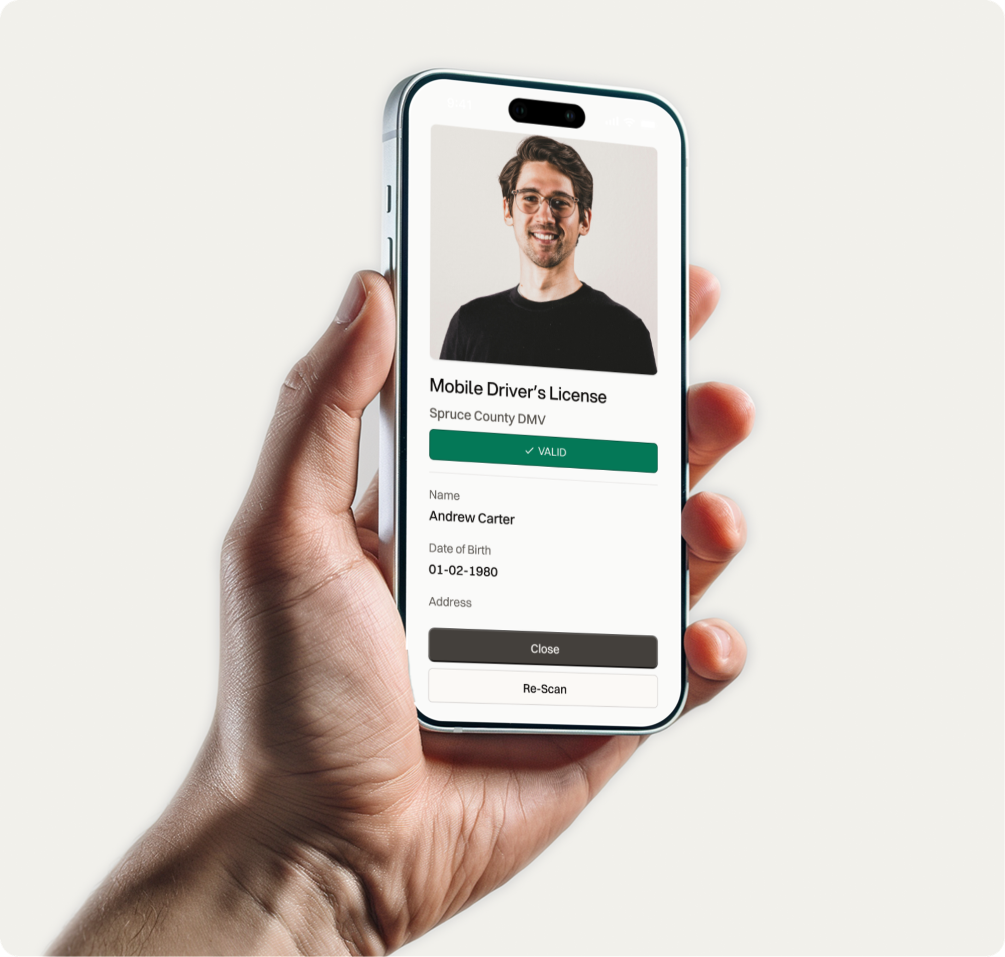
Our visual assets, including mockups, photos, and vector illustrations, play an important role in communicating complex technical concepts to those with varying levels of technical expertise. We prioritize real-world mockups over abstract representations, ensuring our visuals are clear and directly tied to our message.
This approach aligns with our value of inclusivity, making sure our content is accessible and understandable to all audiences.
Evolving our look and feel as a company has allowed us to align more closely with our core values, while making a very technical industry less abstract and more approachable. As we continue to grow and innovate, our brand will remain an important tool in our journey to empower users and drive the modernization of digital identity. This is just the beginning of a new and exciting chapter for us.
If you want to see our new brand identity in practice, check out our newly redesigned website, spruceid.com.